
Overview
Launched in 2018 as a fuel e-payment platform for Petronas Malaysia, Setel has since expanded into a holistic mobility ecosystem. In 2022, Setel entered the electric vehicle (EV) market, enabling drivers to locate and activate charging stations across third-party providers.
Following the MVP launch, I joined the team to take over the product's UX/UI ownership, collaborating closely with cross-functional teams to improve, maintain, and scale the post-launch charging experience. Shortly after, a critical failure in the stop-charging flow surfaced.
To solve this, I redesigned the stop charging experience to replace generic loading screens with step-by-step system status tracking and context-aware self-troubleshooting paths, keeping users informed and in control even during external network failures.
TASK SUCCESS RATE
+37%
users successfully stop charging
SUPPORT REQUESTS
-48%
in related support tickets
YEAR
2023
PLATFORM
Mobile
(iOS & Android)
COMPANY

RESPONSIBILITIES
Interaction Design
Prototyping
Usability Review
Solution
Transparent progress communication
We reworked the bottom sheet copy with the UX writer and replaced the single loading spinner with a visible sequence of steps, so users could see exactly what was happening at each stage of the stop request.
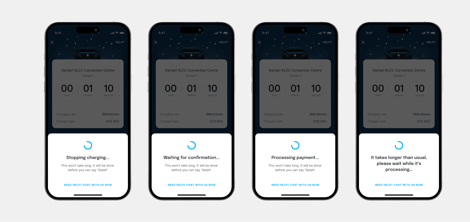
A way out when things go wrong
If the stop attempt failed, users now had actionable next steps and a direct route to contact support with automatic issue tagging so ops had immediate context.

WANT TO DEEP DIVE?
Challenge
How might we create a seamless stop-charging experience that keeps users informed and in control, even during third-party outages or technical glitches?
In early 2023, the customer operations team flagged a surge in stop-charging failures. Certain chargers were going offline unexpectedly due to power outages or technical glitches. When that happened, the charger couldn't receive the stop signal, and users were left stuck, unable to end their session.
The impact varied by charger type. DC charger users were physically stranded, as the cable locks into the vehicle during a session and couldn't be released. AC charger users could technically stop the charge through their vehicle, but many weren't aware of that option.
To get unblocked, users had to contact customer support, who would then escalate to the third-party vendor's operations team to stop the session remotely.
Research
Understanding the user
Prior to the EV feature launch, the team had conducted research into EV driver behaviour. Two insights proved especially relevant to this problem:
EV drivers are information-dependent
Owning an EV in Malaysia's still-developing charging ecosystem requires constant planning, from route decisions, charging schedules, and even contingency prep. These users rely heavily on in-app information to make good decisions, and gaps in that information create anxiety.
EV drivers are tech-savvy problem solvers
Because charging is almost entirely self-service, these users are accustomed to trial-and-erroring their way to a solution. They'll only contact customer support when they've genuinely run out of options.
These two traits were heavily informed the design, it shows that EV drivers didn't need hand-holding, but prefers transparency and meaningful contingency plans.
Usability review of the existing flow
I audited the current stop-charging experience to identify where things were breaking down from a UX perspective.
Infinite loader giving a "frozen app" illusion
Once users tapped "Stop Charging," they saw one loader with no indication of what was happening in the background. When it ran for more than a few seconds, users assumed the app had frozen, which prompted many to force-quit.
No alternative paths or next steps
There were no alternative routes, support links, or self-troubleshooting steps provided on the screen if the connection timed out.

UX issues with the initial "Stop" button
To prevent users from spamming the system with multiple requests, the initial "Stop charging" button was hidden after the first tap. If the user force-quit the app, it'll not reappear, which left users with a screen with zero actions to take.

Technical mapping
I worked with the engineering team to understand the full data flow from the app, through Setel's servers, to the third-party vendor's system, and back. This was critical context.
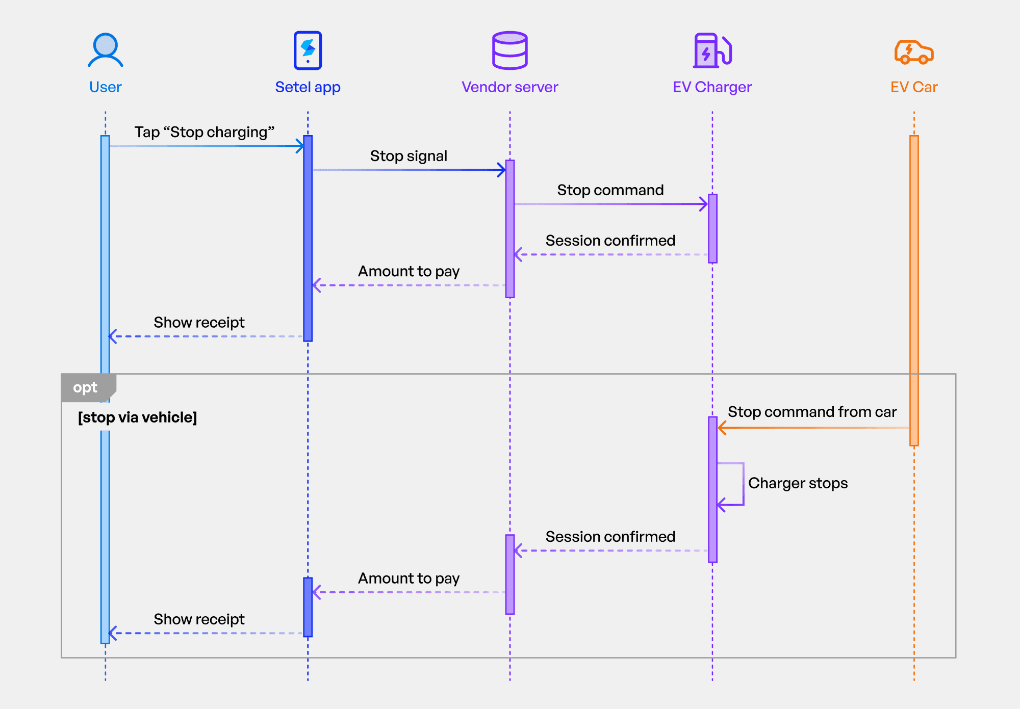
The key constraint: Setel acts as a middleman
We can only send a stop signal to the vendor and can't directly control the charger. If the charger is offline, the signal simply doesn't arrive. Even Setel's own customer support team faces this same limitation; they have to escalate to the vendor's ops team. This meant any solution had to work within that constraint and couldn't rely on a technical fix we didn't control.
Key design decisions
1
Rewriting the copy on the bottom sheet
Working with the UX writer, we reworked the language throughout the stop-charging flow to focus on system status and user control. The goal was to acknowledge that stopping a session involves multiple steps happening in the background, and to surface that process rather than hiding it behind a single loader.
2
Self-troubleshooting and support escalation
If the stop attempt failed, users were no longer left stranded on a dead screen. We introduced a self-troubleshooting step with actionable guidance (for example, informing AC charger users that they could stop the session through their vehicle). We also added a direct in-app route to contact customer support, with automatic issue tagging so that ops could immediately understand the context without the user needing to explain everything from scratch.
What I learned
The power of system status transparency
The team was initially worried that exposing backend granular steps might clutter the screen or increase user anxiety. In practice, structured progress communication made the experience feel more in control, not more complex. Giving users visibility directly mitigated their panic.
Cross-functional collaboration is key
By looping in the Operations team early, we realized that our support agents were just as frustrated by a lack of context as the drivers were. Designing a solution that fed specific data tags directly to Ops proved that product design can simultaneously solve user pain points and optimize internal business workflows.
Working within constraints requires knowing exactly what they are
By understanding the technical architecture, in which that Setel was middleware, not the charger, made it possible to design a realistic solution. There was no fix that would make the charger obey a stop signal it couldn't receive. The design had to work around that fact.
