Overview
As part of Setel's expansion into the e-commerce sector in 2020, a new online checkout platform to allow users to pay at various merchants using their Setel balance. While the payments worked well, the checkout process felt a bit disconnected, often requiring customers to start from scratch with their details every time they visited a new merchant.
I redesigned the checkout architecture, creating a smarter way to handle customer information that turned a repetitive task into a quick, one-click checkout.
TASK COMPLETION TIME
+25%
in subsequent checkout speed
USER ADOPTION
30%
active users in the first 3 months
YEAR
2022
PLATFORM
Web App
(Responsive)
COMPANY

RESPONSIBILITIES
Interaction Design
User Flows
Prototyping
User Research
Design QA


Solution
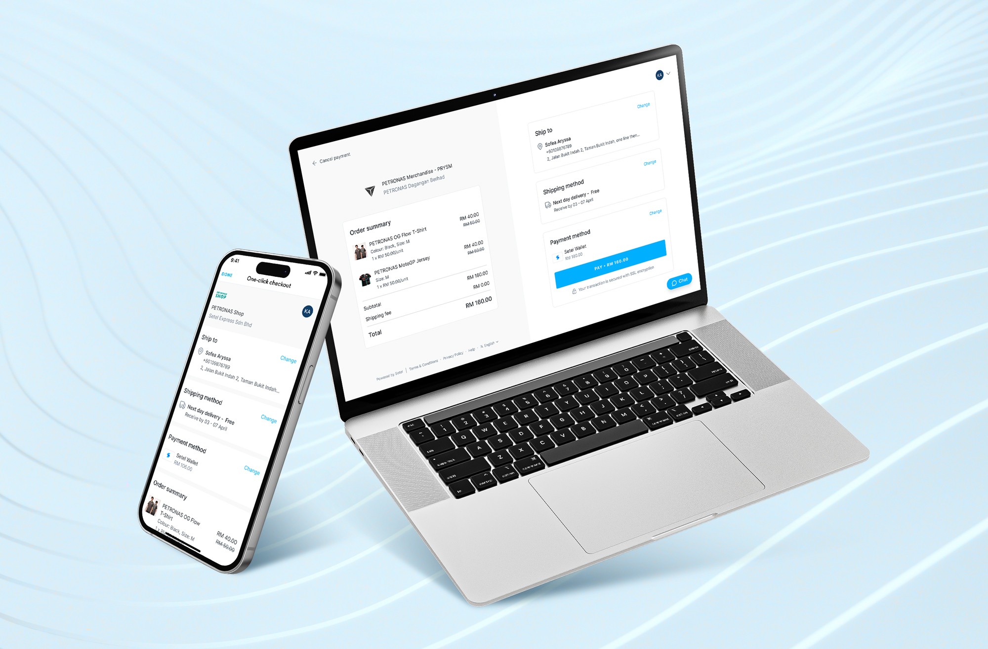
Easy checkout at your fingertips
Customers enter their shipping and billing details once. This information is then securely stored and automatically filled in for future purchases at any Setel partner merchants.

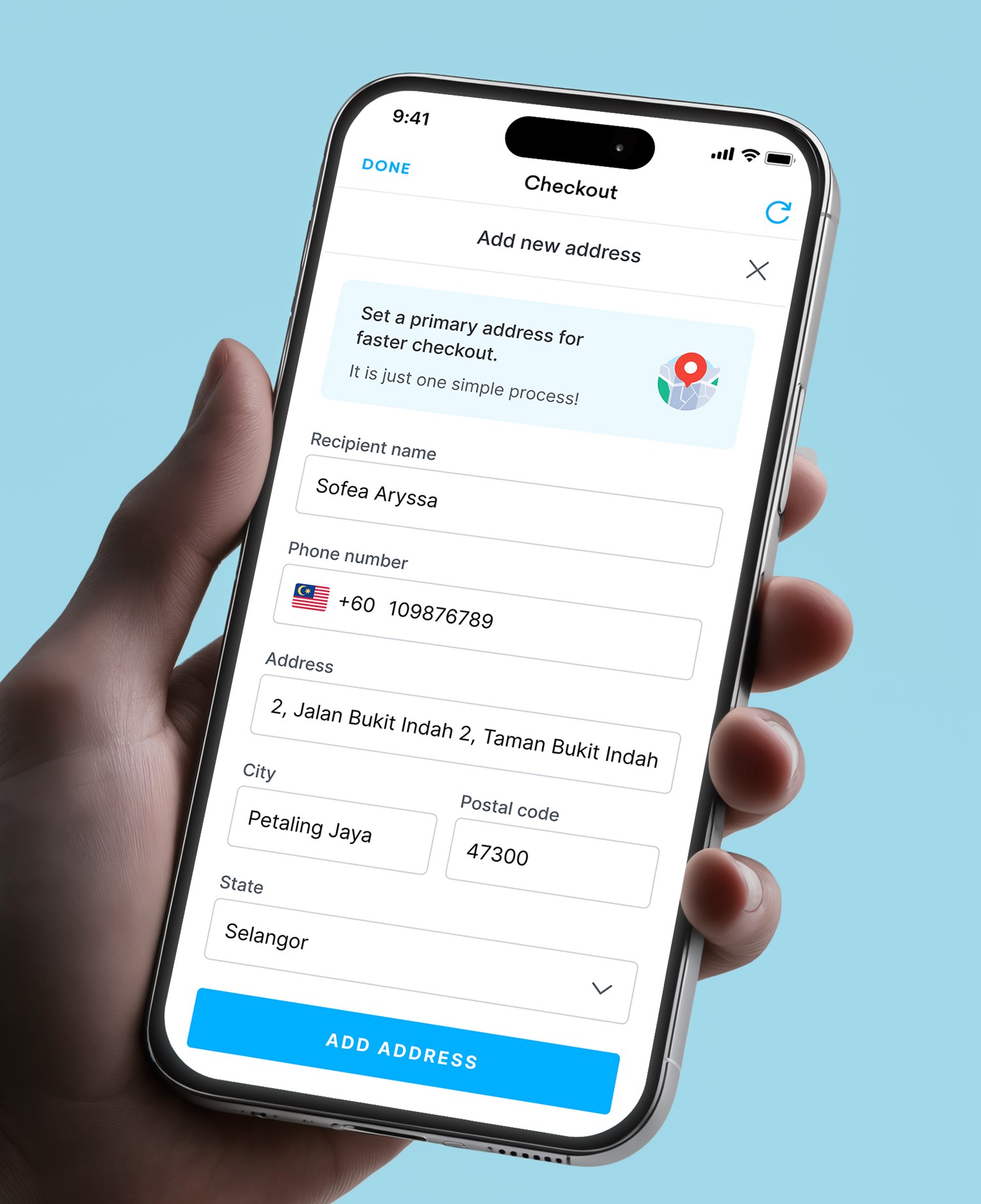
Centralised address management
A centralized address management system that stores and syncs shipping details, eliminating repetitive data entry for faster, error-free checkouts.

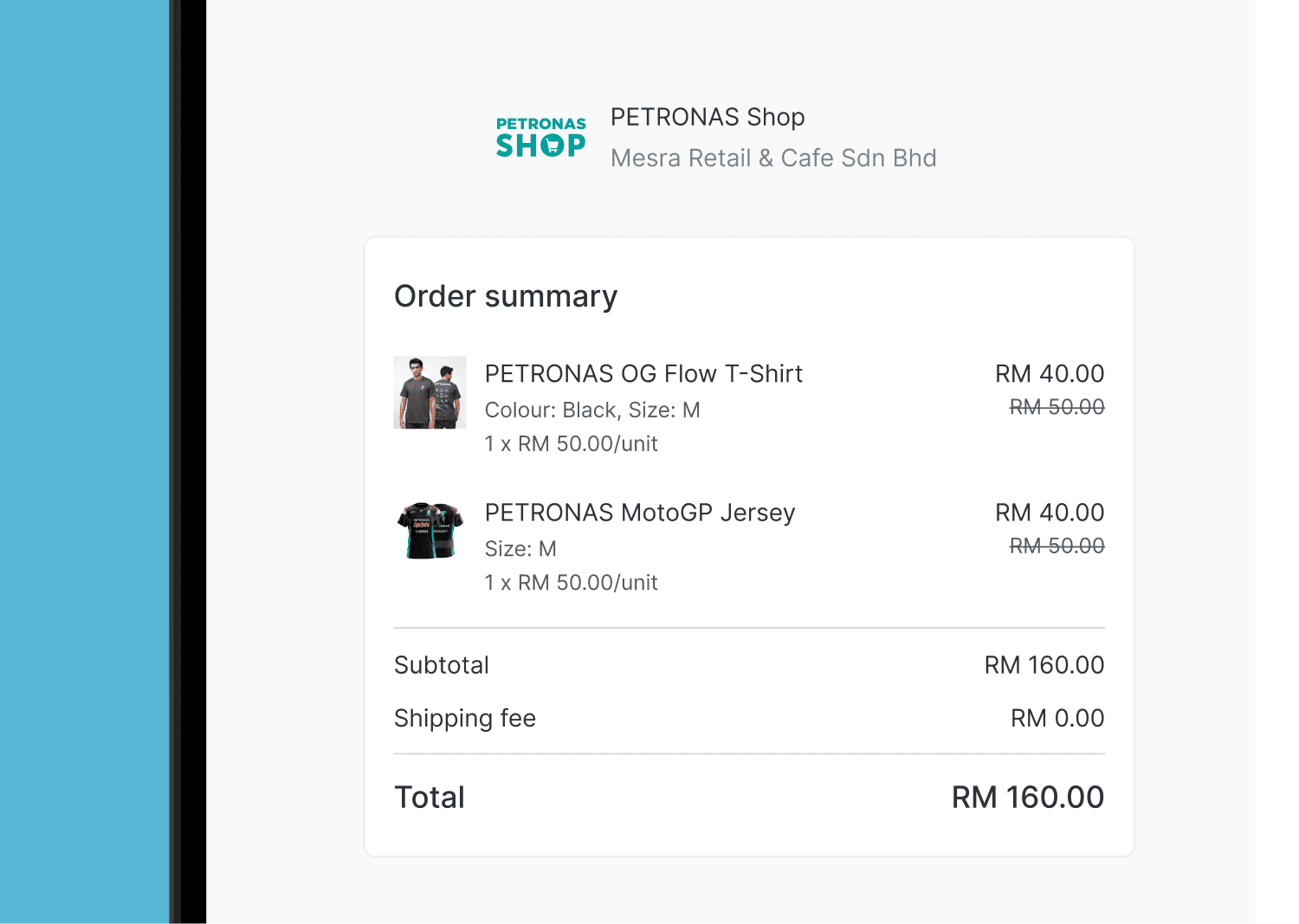
Enhanced order review
Improved the shopping cart display on desktop and mobile to allow users to review their selections clearly before checkout.

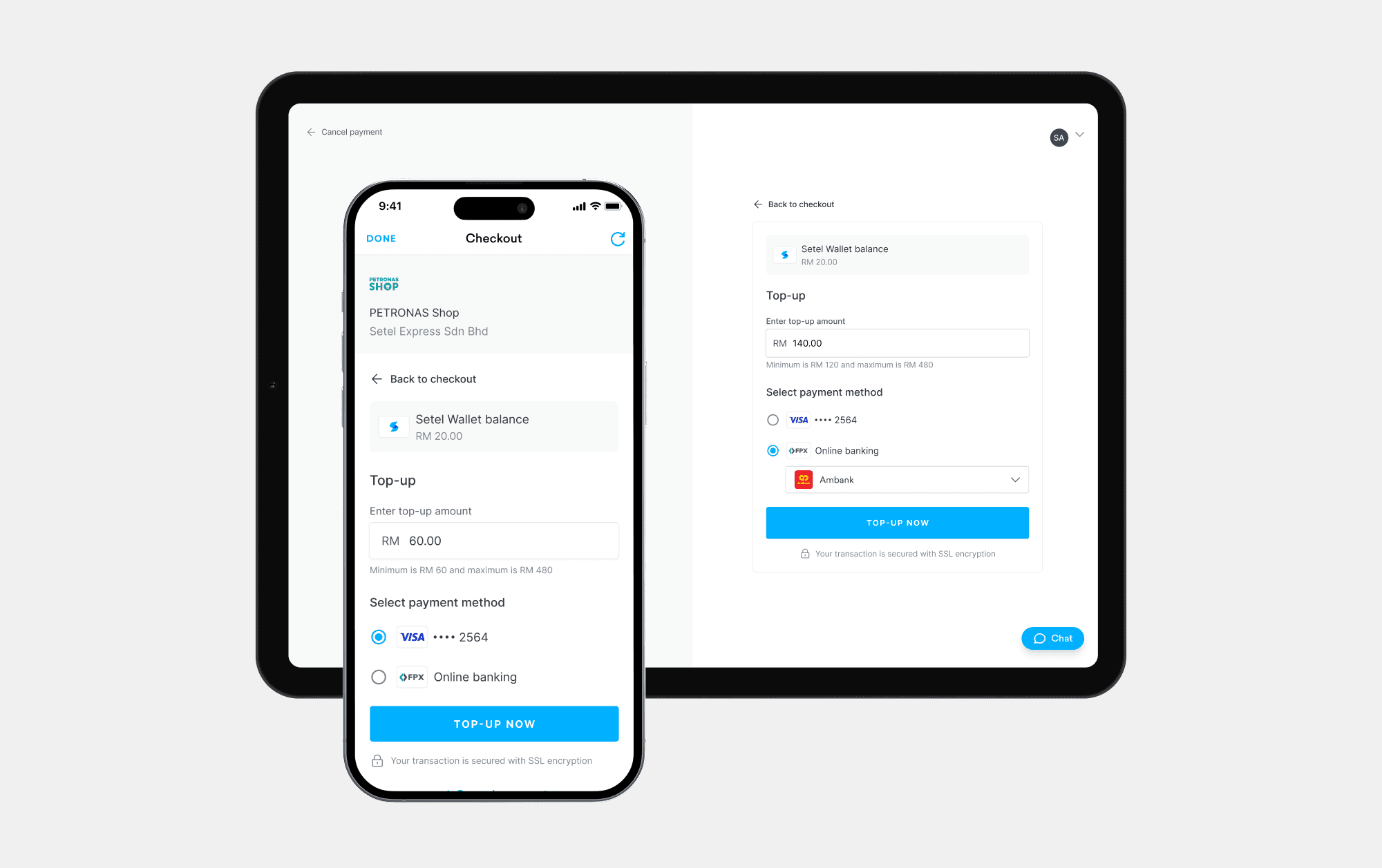
Revamped top-up screen
Redesigned the top-up screen to reduce drop-offs and align with the unified design system.
WANT TO DEEP DIVE?
Challenge
How might we provide Setel customers a seamless and unified Setel checkout experience across multiple merchants?
Originally, the Setel checkout experience was built primarily to handle payments, which meant the transition from payment to delivery wasn't fully integrated across the platform. This created a repetitive experience where customers had to start their shipping details from scratch with every new merchant they visited.
As Setel expands its partnerships with more online stores, this issue became a critical barrier to user adoption and retention, as it was a tedious process for frequent shoppers.
Research
Understanding the checkout landscape
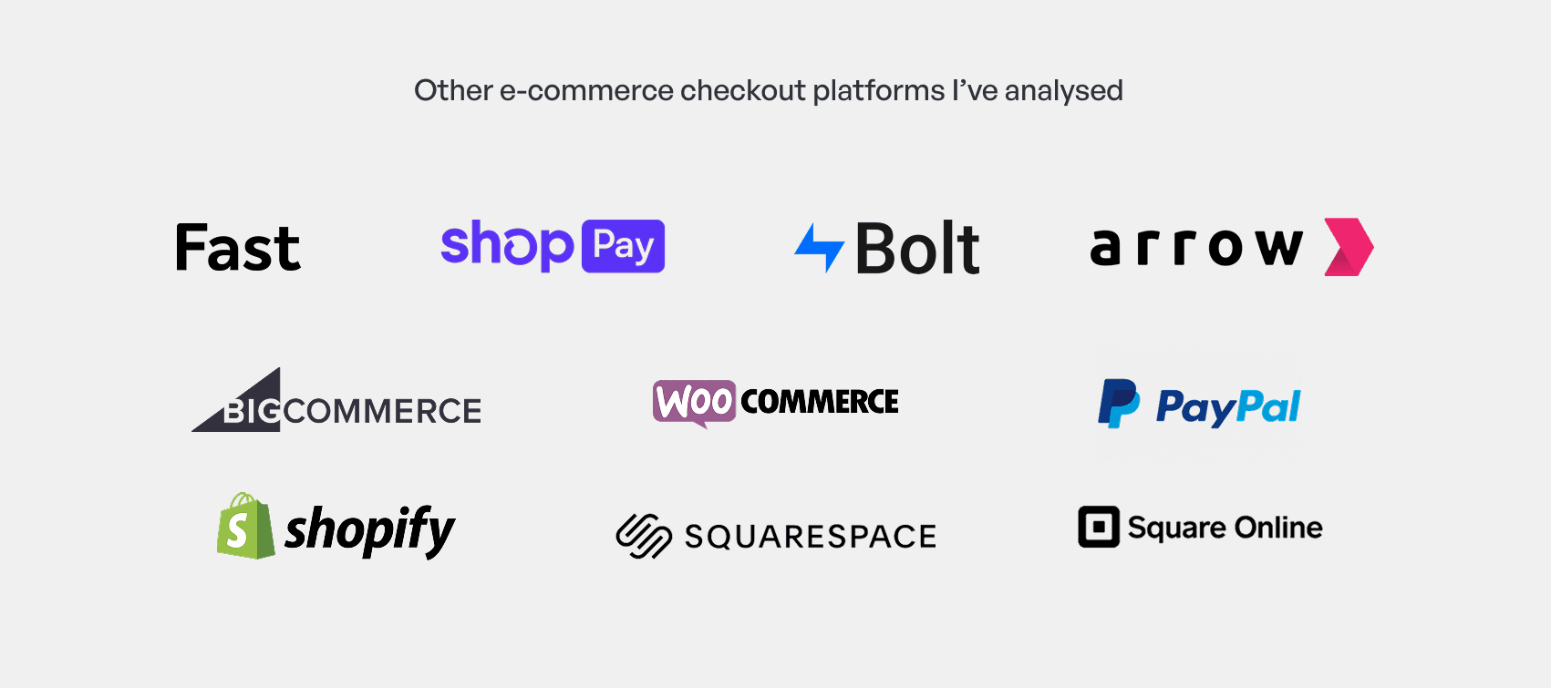
I first conducted a thorough analysis of existing checkout solutions in the market was first conducted to help understand what customers generally expect from a checkout process.
Key Insights
Only ask for the information absolutely necessary to fulfill the order. Don't overwhelm customers with unnecessary fields.
Allow customers to save their shipping and billing details securely for future purchases. This eliminates the need to re-enter information for every transaction.
Always include an order review page before finalising the purchase. This allows customers to double-check their selections and make any corrections before placing the order.
Identifying Usability Issues in the Checkout Process
Since my involvement in building the original Setel checkout platform was limited, a heuristic review was conducted to understand the current user experience. The review uncovered several issues, including:
Limited scalability on desktop
Large orders caused the desktop interface to break as the fixed-height display couldn't scale. This causes information to be hidden due to data overflow.

Hidden order details on mobile
Mobile order details were hidden behind a toggle, adding unnecessary friction to the final checkout confirmation.

Fragmented UI
Inconsistencies between Setel-native checkouts and 3rd-party integrations.

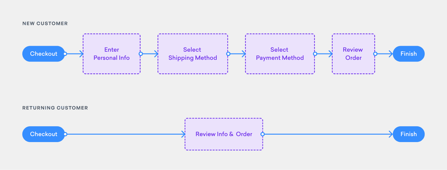
User flow
A user flow was created to map out the ideal checkout process for Setel customers, prioritising the reduction of barriers, especially for returning customers.
Design explorations
Initial explorations were focused on figuring out the best way to display input fields to the customer to the mental load of making decisions off them. I prioritized a mobile-first approach, focusing on optimizing input field layouts to reduce cognitive load and prevent information overload on smaller screens.

The designs were brought to design review sessions for feedback from other designers in the company. After a few rounds, I narrow down to 2 options to bring it to user testing.
Option 1:
One-page layout
Hypothesis: Fewer clicks equals faster sessions.


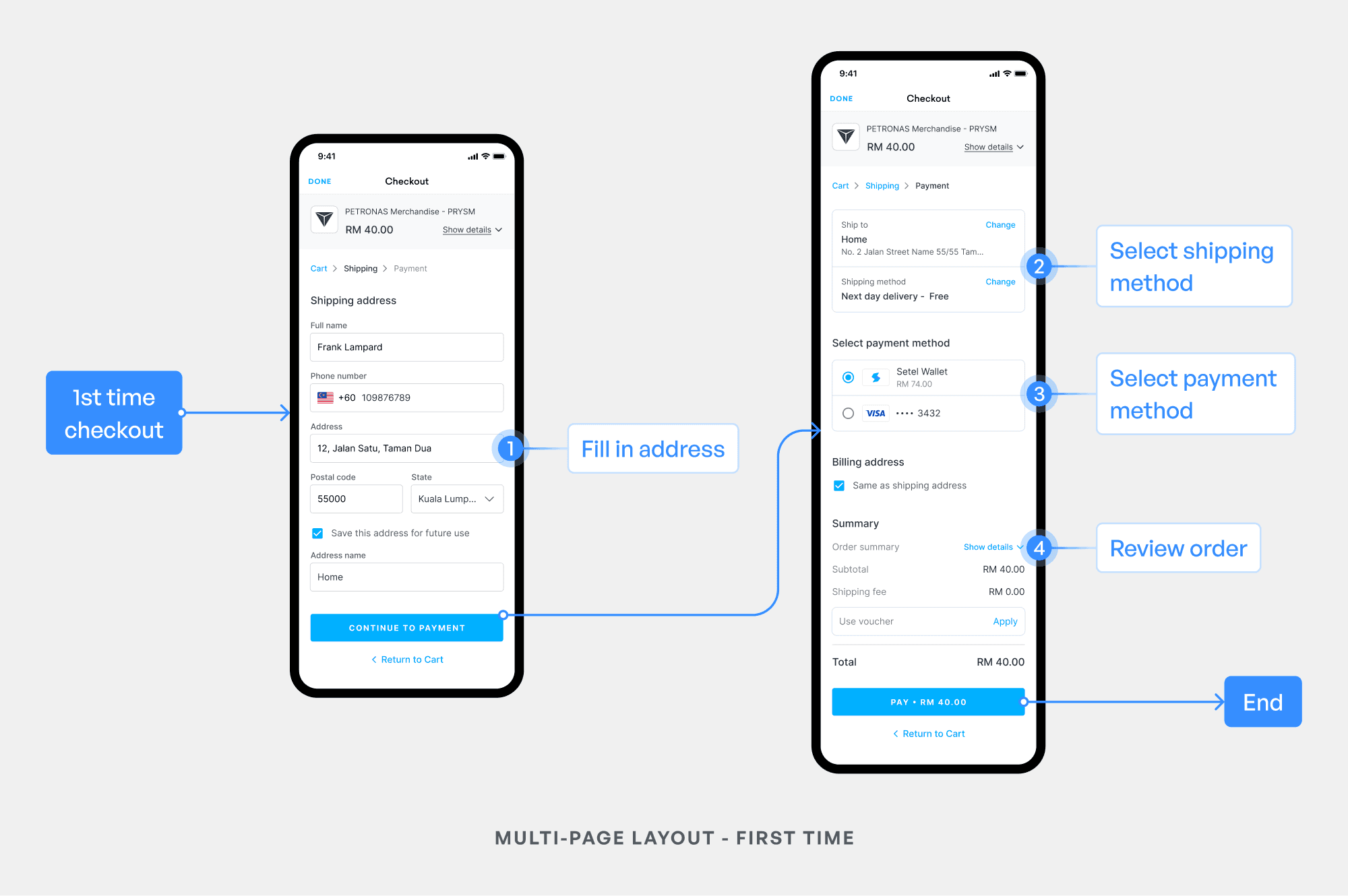
Option 2:
Multi-page layout
Separating address entry from payment. Hypothesis: Reduction in cognitive load leads to higher accuracy.

Usability testing
To evaluate the effectiveness of our new checkout design, I prototyped the two options and ran A/B testing with 20 participants, simulating end-to-end journeys for new and returning customers.

The user testing had two main objectives:
Speed and efficiency
Which design facilitated a faster and smoother checkout experience, particularly for returning customers.
Feature understanding
Did users clearly understand the purpose and benefits of the new checkout features?
Contrary to our initial assumption, the single-page layout led to higher misclick rates. Testing revealed users tends to be in a "payment mindset" looking for how to pay and skipped the address section entirely. The multi-page flow actually proved faster for first-time users because it provided clear, sequential focus.

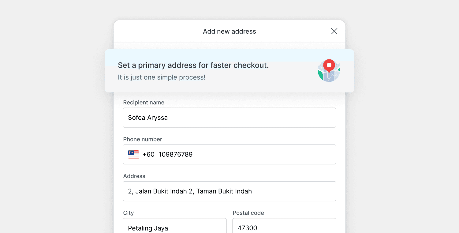
During testing, I identified user hesitation around address entry, where they are unsure if address input is a one time thing. A contextual banner was introduced explaining that this was a "one-time setup", which significantly improved completion rates.
What I learned
Clicks ≠ Friction
While the single-page layout had fewer steps, it overwhelmed users, causing them to miss critical address fields because they were already in a "payment mindset." By moving to a multi-page flow, I traded one extra click for higher focus and lower error rates.
Heuristic evaluations uncover hidden friction
Even when not the primary project goal, a systematic audit can quickly identify usability gaps. Applying these methods allowed me to pinpoint and resolve inefficiencies that had previously gone unnoticed, directly improving the end-to-end customer experience.
Delivering value in stages
We did faced a significant technical hurdle during the project: the API for dynamic shipping fee calculations wasn't ready. Instead of delaying the launch, I collaborated with the product team to find a workaround. By leveraging Setel’s internal logistics to offer free shipping for the launch, we were able to ship the core address management feature on time.
