Overview
In the Setel app, there's three things a driver sets up and then walks away from: paying for street parking, parking in a mall lot with license-plate recognition (LPR), and charging an EV. The pattern is the same each time, the customer would start the session, put their phone away, and don't think about the app again, unless something goes wrong.
I designed iOS Live Activities for all three, putting live status on the Lock Screen and Dynamic Island so drivers don't have to reopen the app to check on themselves. They get the information they need at a glance, saving time and preventing last-minute stress at the exit gate.
YEAR
2024
PLATFORM
Mobile (iOS)
COMPANY

RESPONSIBILITIES
Interaction Design
Prototyping
User Research
Solution
A consistent Live Activities system across 3 different use cases.
Street parking, LPR, and EV charging all use the same anatomy, including a timer, car plate number, and a use case icon. Drivers get a familiar visual layout and predictable data hierarchy, no matter which service they are using.
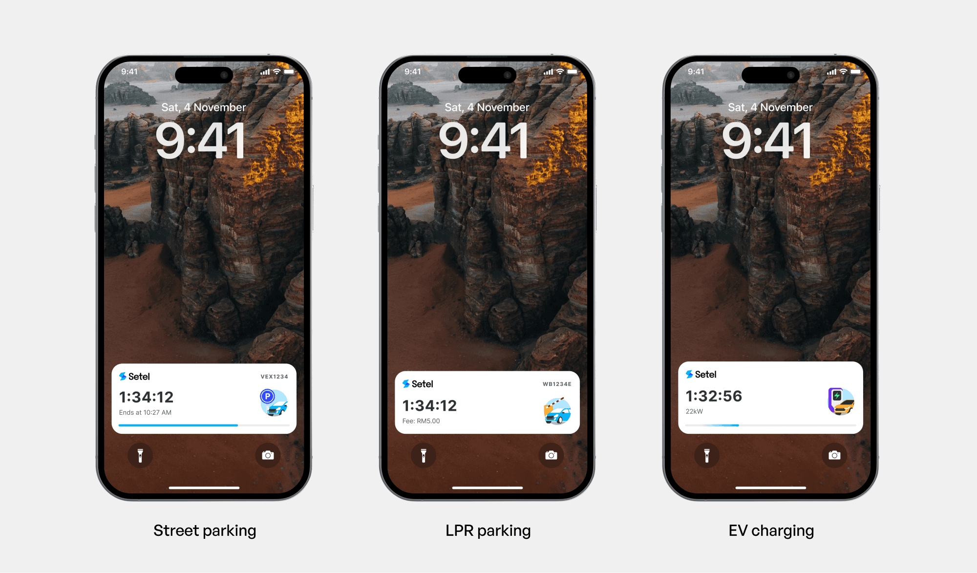
Surfacing urgency only when relevant.
The UI stays quiet and subtle during normal status tracking. Visual alerts and high-contrast color shifts (amber/red) only trigger during key moments, like when a street parking is 10 minutes from expiring or when mall parking fees exceed the wallet balance, to ensure the warnings actually catch the user's attention when action is needed.
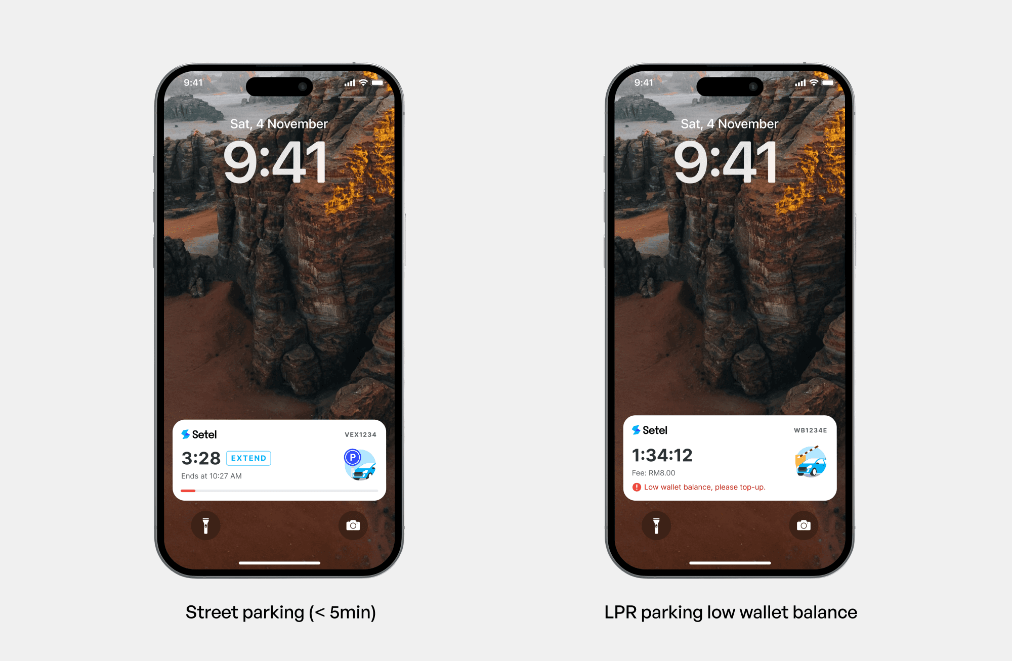
Compact versions on the Dynamic Island
Designing for the Dynamic Island meant stripping away everything non-essential. In its compact state, each session condenses down to a single primary metric: the timer, so drivers can keep tabs on their session at a glance without interrupting whatever else they're doing on their phone.

WANT TO DEEP DIVE?
Problem
Before Live Activities, all three of these use cases: parking time remaining, LPR session duration, EV charging progress, lived entirely inside the app. That created the same failure pattern in all three products, just with different consequences.

Street Parking
Users forget when their purchased time expires, which put them at risk of getting a parking ticket.

LPR Gated Parking
Drivers are drivers blind to their exact elapsed time and accumulating costs until they hit the exit barrier.
If their stored balance or payment method doesn't cover the session cost, they find out at the exit gate, with a car behind them and a barrier that won't lift.

EV Charging
Drivers are forced to continually check their phones to monitor charging progress, leading to "range anxiety" and extended dwell times at charging bays.
In all three cases, the core problem was the same shape: critical time-based or balance-based state was locked behind an app-open action, at exactly the moments customers were least likely to open the app.
Opportunity
How might we give customers a trustworthy, glanceable sense of their time and payment status without requiring them to open the app
Underneath all three problems was the same gap. which is customers needed to trust that their status was current without having to open the app go check for themselves.
Research
There was no formal research phase or user testing on this project, which shaped my approach rather than limiting it. I validated through three channels instead:
Support tickets
Rather than guessing at what confused people, I went to existing support tickets and CS logs for both the street parking and LPR products. I found that exit-gate balance issue on LPR, in particular, is something that our customers are really facing.
Competitive research
I looked across how other apps used Live Activities for comparable "state I need to track passively" problems, like ride-hailing ETAs, food delivery, sports scores, other parking and EV apps where available.
The goal was to understand what iOS's Live Activities actually make possible.
Platform-constraint research
A meaningful chunk of "research" here was closer to engineering discovery, to figure out what is even technically possible to design for.
Where I'd have used real user testing
The visual escalation logic for street parking and LPR parking, whether the visual alerts when timer is ending or when the user have insufficient wallet balance does actually register to the customers.
How the LPR balance messaging reads and whether the customer understood.
Both are genuinely testable hypotheses I wasn't able to validate with real customers on this project's timeline.
Explorations
1
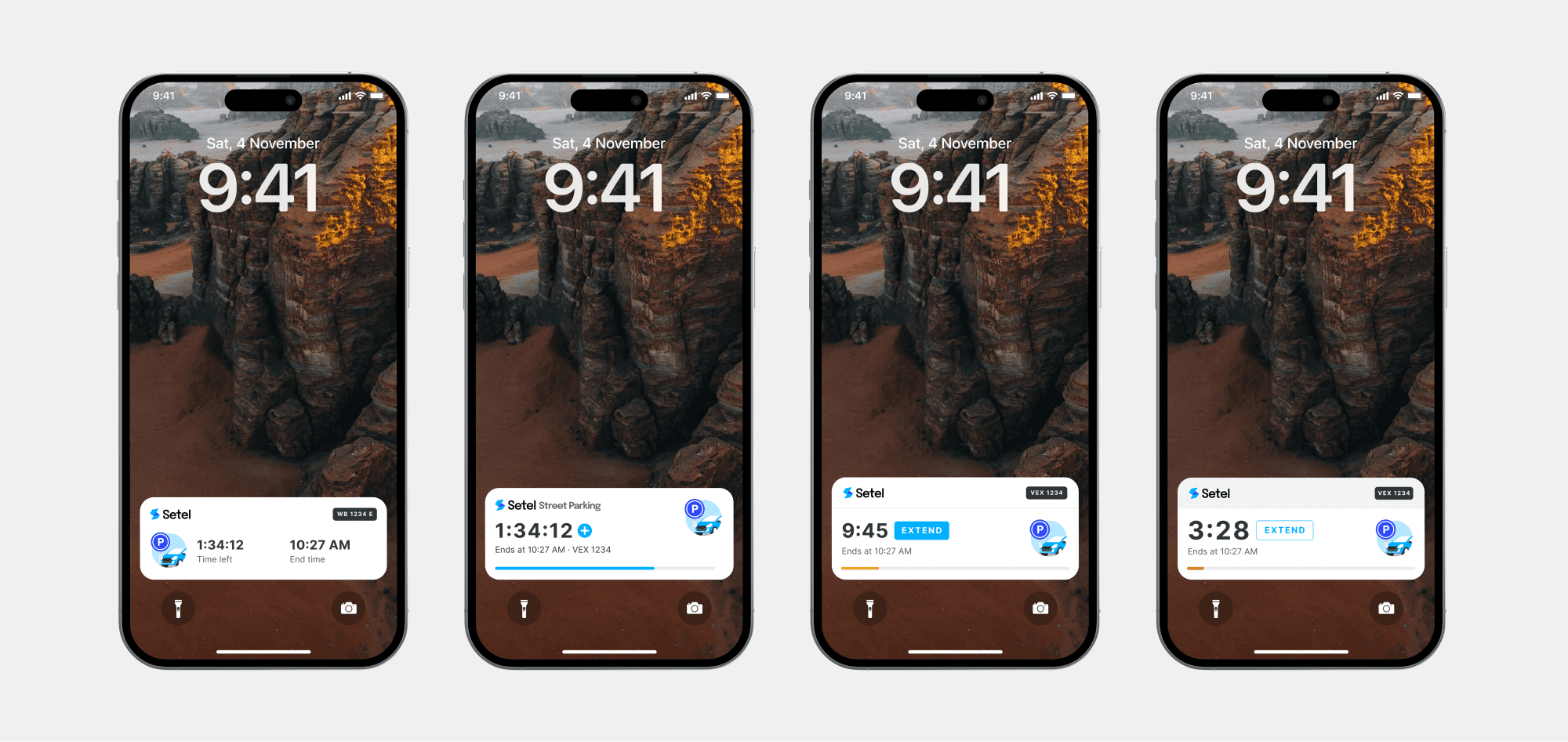
Street Parking: How to signal "timer running low" without it being too alarming.
Early explorations tried a single static color the whole session, a color that shifted gradually, and a color that snapped at fixed thresholds (e.g., green → amber at 15 min left → red at 5 min left). I landed on threshold-based snapping: gradual shifts are elegant but unreliable at a glance.
2
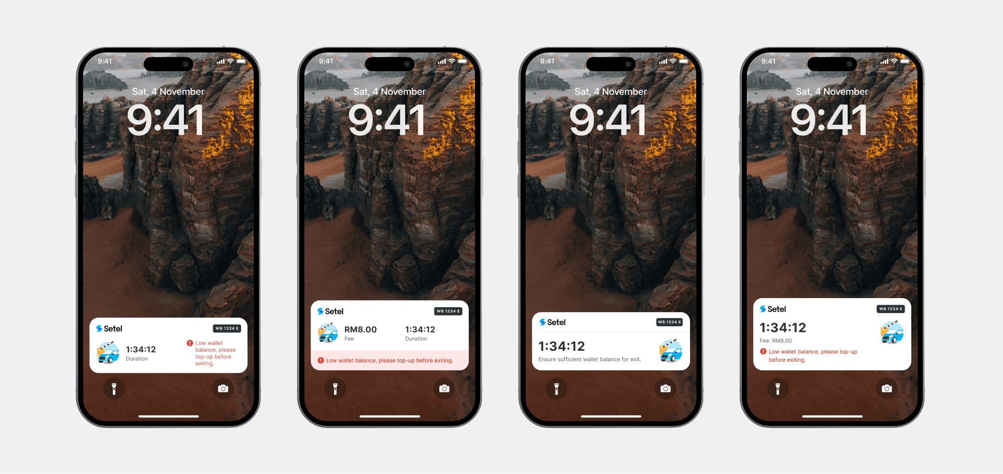
LPR Parking: How to effective tell customers that their wallet balance is insufficient to pay for their exit
What was important was how can we design the low wallet balance state that has a noticeable difference so customer. The side-by-side layout that was one of the options was rejected as in this state the timer competed for attention and diluted the urgency of the balance issue when it existed.
3
EV Charging: How can we show that the car is still charging
We had a lot of constraints for our EV feature as there were no battery percentage, no full-charge estimate, and no idle fee to count toward, and we couldn't confirm a full charge either. So the timer just counts up for the life of the session. It's the most honest thing to show: the session is still active, without pretending to know how far along it is or when it'll end.

Key design decisions
Decision 1: Maximizing the Compact Dynamic Island
The Compact Dynamic Island limits us to just two slots. To make the most of this space:
Brand Recognition over Category Icons
Early explorations used custom icons for each vertical (street, garage, EV), but this obscured app ownership. We finalized a standardized layout: the Brand Logo on the left and the Timer on the right, while using high-contrast color shifts (amber/red) to signal urgency without adding visual noise.
Multi-Session Logic
When a driver is simultaneously parking in an LPR lot and charging their EV, the Dynamic Island defaults to tracking EV Charging Progress (the primary activity). However, if accrued parking fees exceed the user’s wallet balance, the system triggers an Urgency Override, temporarily replacing the EV status with the Low Balance alert so the driver can top up before reaching the exit gate.

Decision 2: Designing for degraded/offline states and timeout.
Because Live Activities live outside the app and connectivity is not always guaranteed especially during underground parking, a stale/reconnecting state needs to be explicitly designed as well, instead of leaving an old timer on screen that looks live but isn't.
Live Activities can only be updated live for up to 8 hours, until they expire. After expiration, an activity can continue to be displayed for up to 4 hours but as the timer will stop moving, I asked the developer to remove the display after 8. As a user could potentially park up to 8 hours, a push notification is sent to remind drivers that they still have an active parking session.

What I learned
Designing for a surface I don't control
Live Activities are governed by the OS, not by me. Its refresh timing, layout regions, and interaction are all fixed. That flipped my usual process: instead of starting from an ideal layout, I started from "what does the platform actually allow," then designed within it.
How to design for consistency across related products
The different mechanics of the 3 use cases needed to feel like one design language to make it feel like it's from the same app. By keeping the core layout similar, it can also reduce the learning curve for users as there will be a certain level of familiarity even if they are switching between use cases.