Overview
Setel started as a simple way to pay for fuel at Petronas, however over the years it has evolved into a comprehensive motorist "super-app", offering other mobility services such as EV charging, parking, insurance, and more. As the feature set grew, the original homepage began to limit the discoverability of these new services.
I redesigned the landing experience to replace the static map with a dynamic, personalised interface. This surfaces the right feature at the right time for our 4 million users, driving app usage well beyond the petrol station.
FEATURE DISCOVERY
discoverability of other non-fuel features
USER GROWTH
EV user base
YEAR
2023
PLATFORM
Mobile
(iOS & Android)
COMPANY

RESPONSIBILITIES
Interaction Design
Design System
User Flows
Prototyping
User Research


Solution
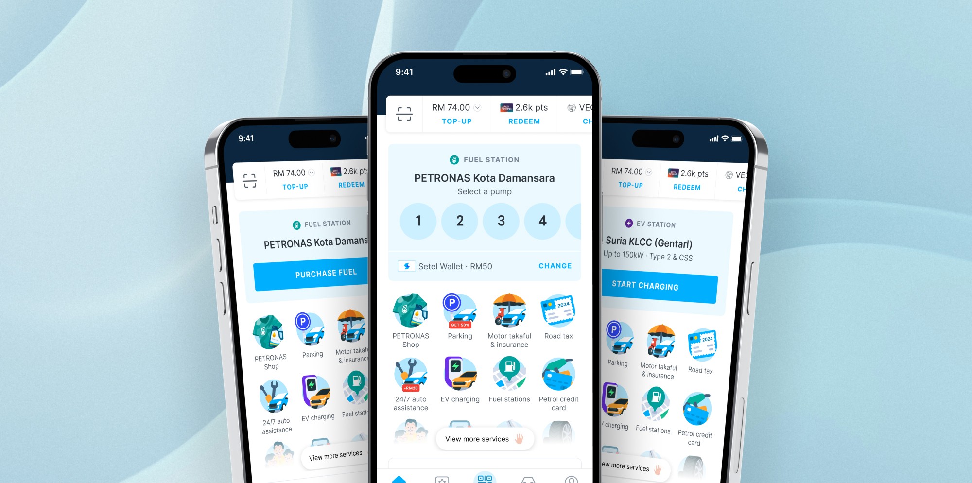
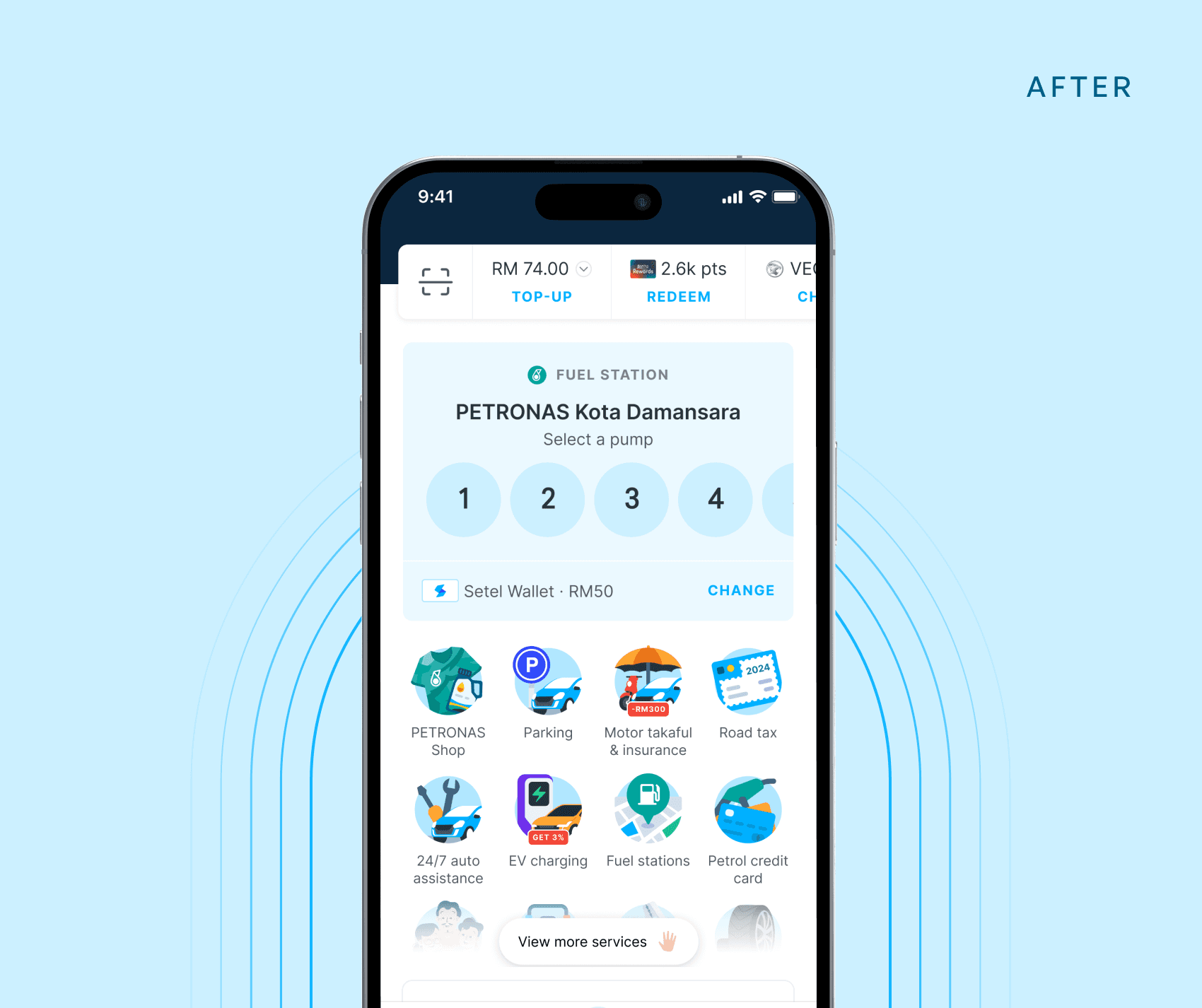
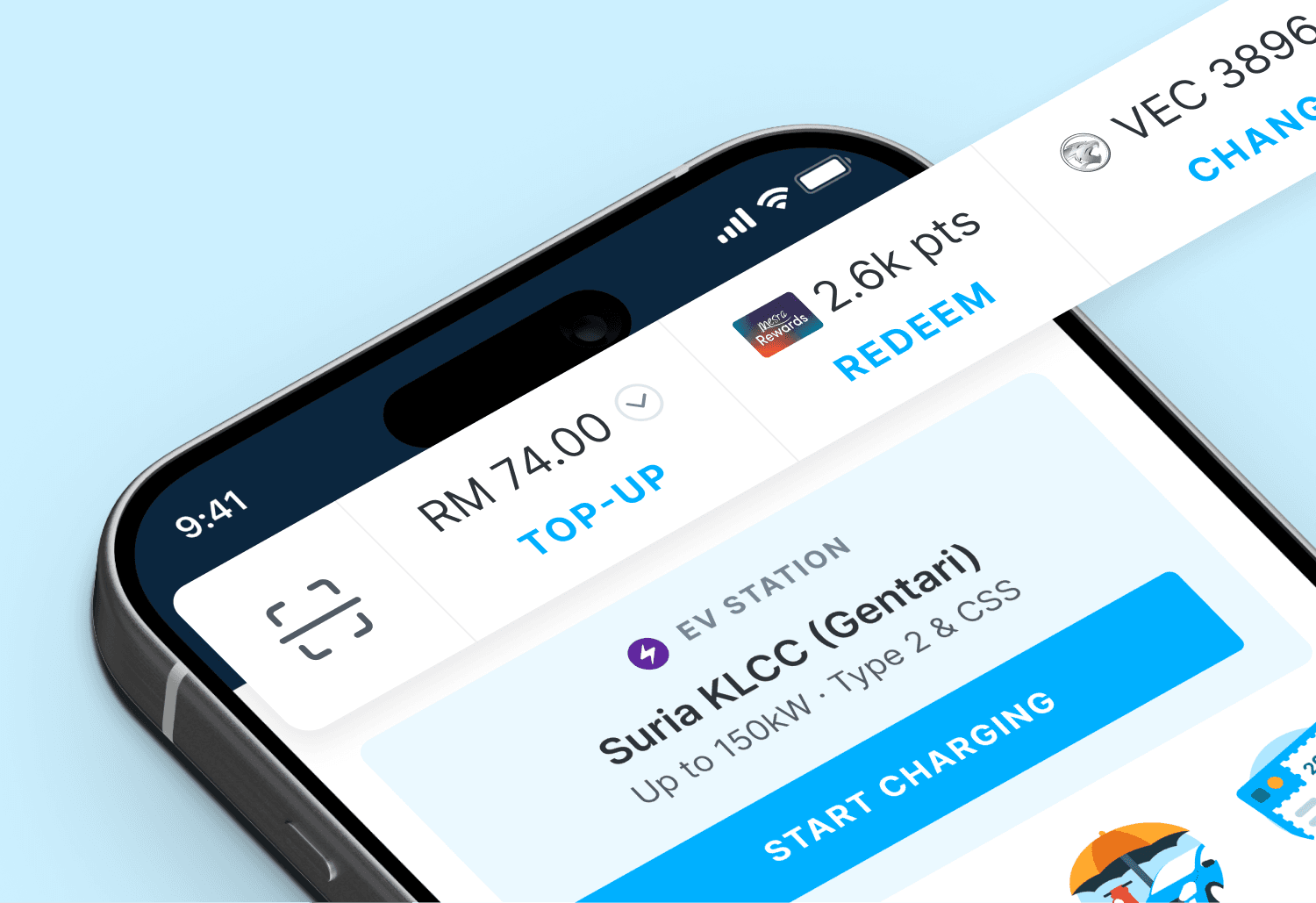
Personalised service cards
Fuel, parking and EV charging cards will appear dynamically based on the location when the user launches the app.
More services at a glance
By de-prioritizing the map, the space allowed a clear service grid to be introduced to showcase the full mobility suite without much scrolling.

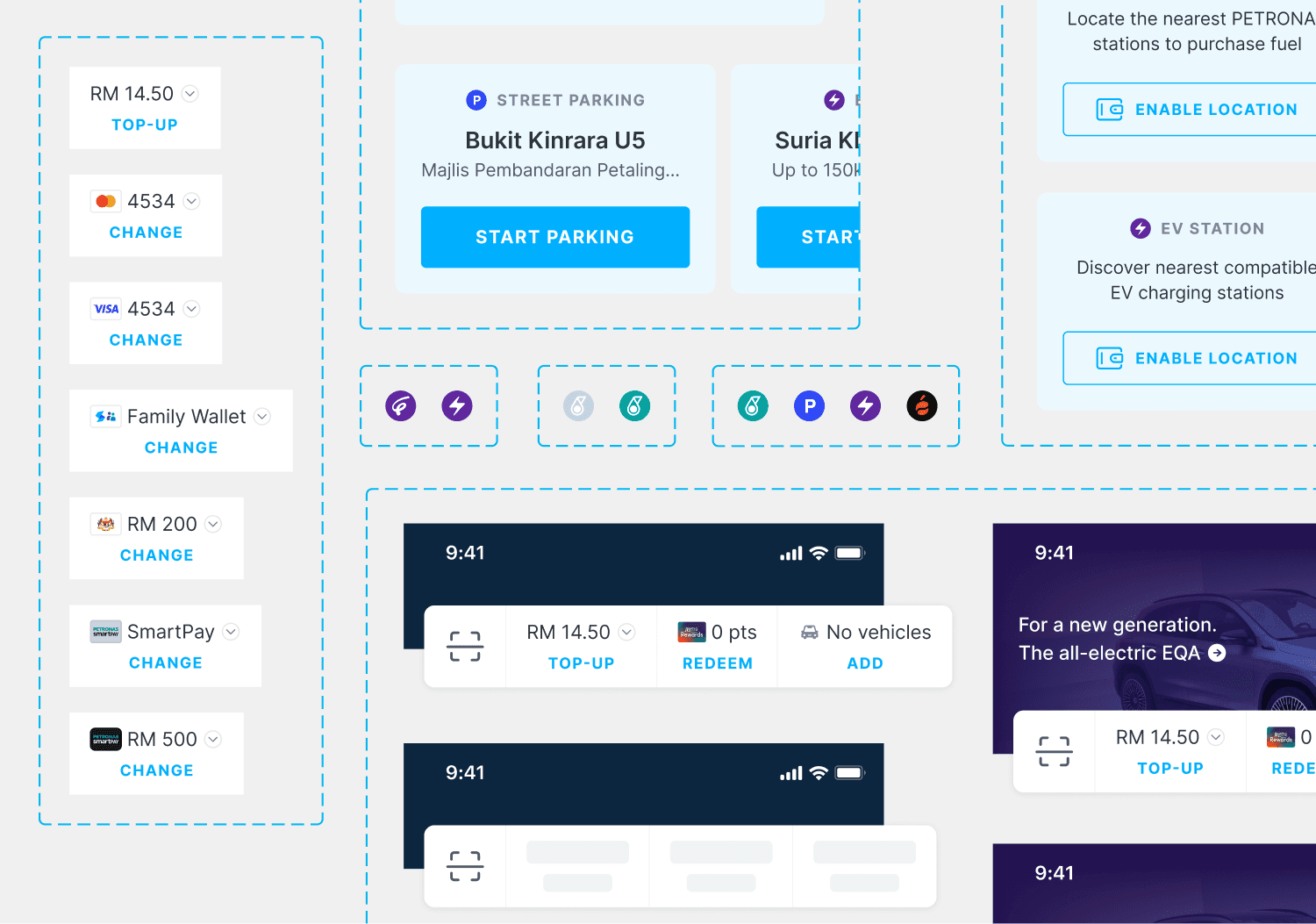
Action bar
A new horizontal shortcut bar for instant access to high-frequency tasks, and allow EV users to quickly add their vehicles to access EV features.

Design system
Designed modular components to ensure visual consistency and streamline development process.

WANT TO DEEP DIVE?
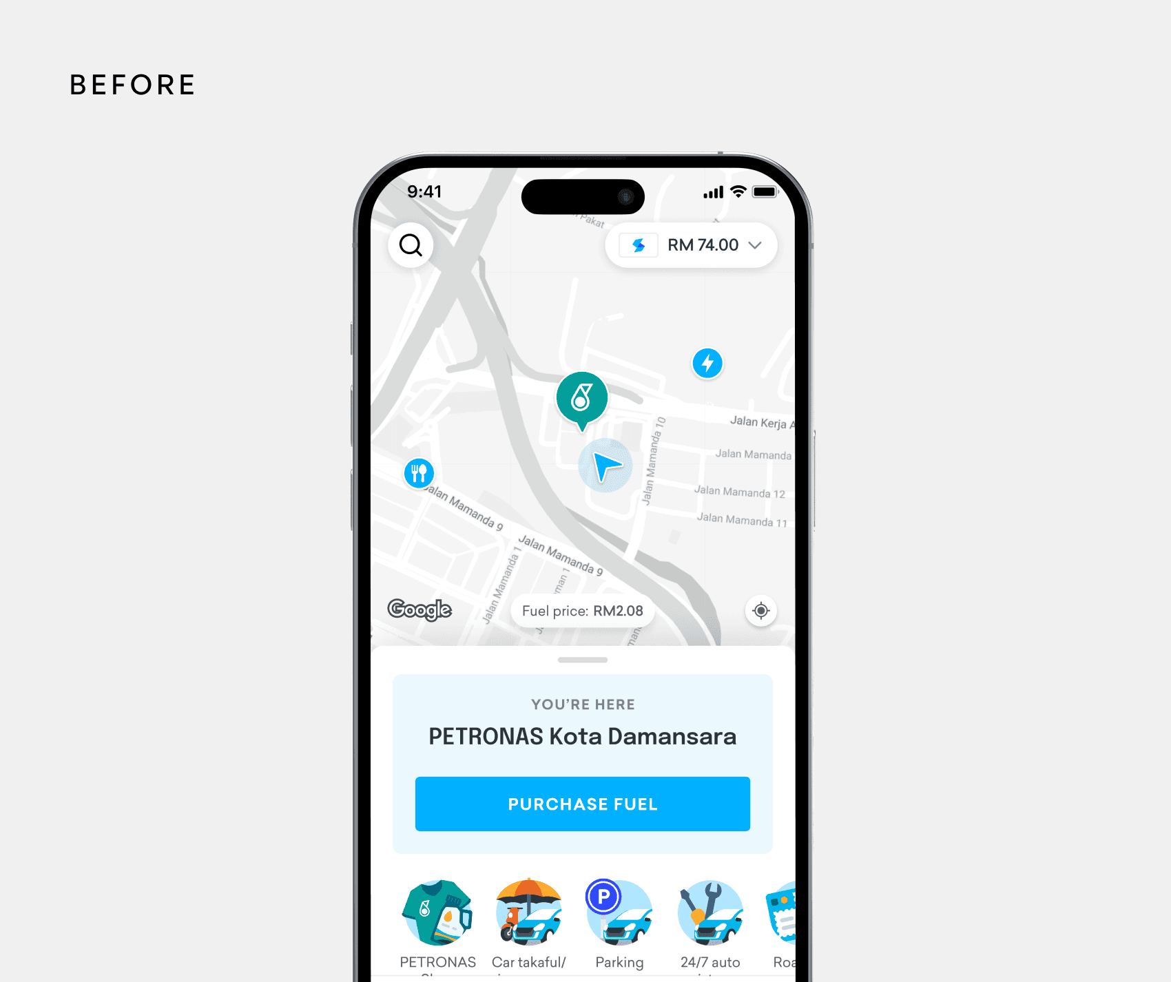
How it started
The project began without a clear brief. The homepage had organically accumulated features over the years, and while there was a general sense that something wasn't working, no one had defined what "better" looked like.
To get aligned, our user research team organised a brainstorming session with PMs across Setel's product verticals: fuel, EV charging, parking, and payments. I joined as a participant alongside the researchers, bringing a design lens to what was otherwise a product-priorities conversation.
Each vertical had its own goals, and part of what made this session valuable was hearing how differently each team defined the problem. For the fuel PM, the homepage was fine. For the EV PM, it was nearly invisible to their users. For payments, key features were buried under multiple taps.
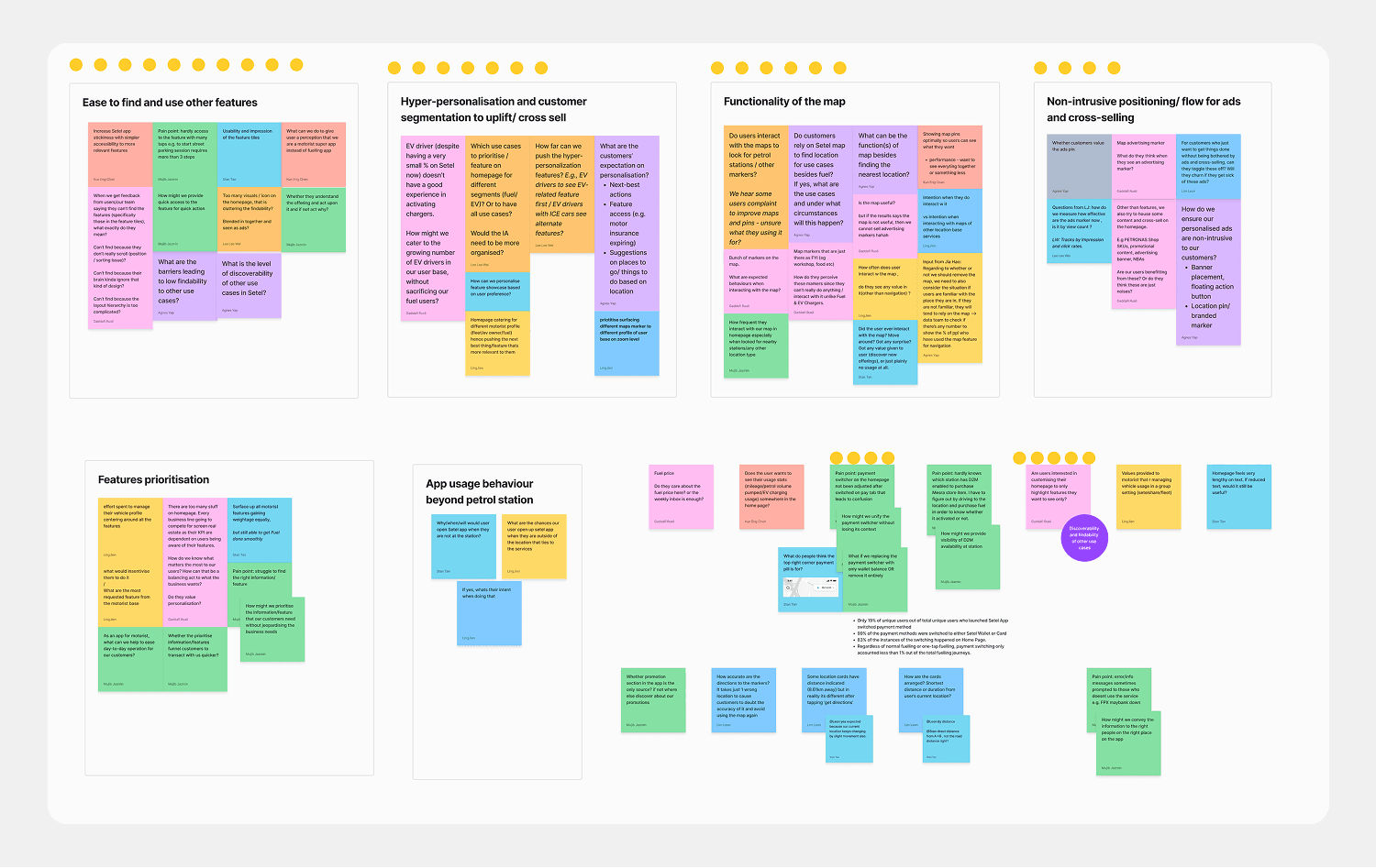
We left the session with a clearer picture of the problem space, but no consensus on direction. What it gave me was something more useful at that stage: a map of competing priorities I'd need to navigate through design.
Challenge
How might we design a streamlined homepage that surfaces a diverse range of products while intuitively cater to user needs?
The current Setel homepage is tailored for the fuelling journey, with the expansion into additional services, several issues have surfaced:
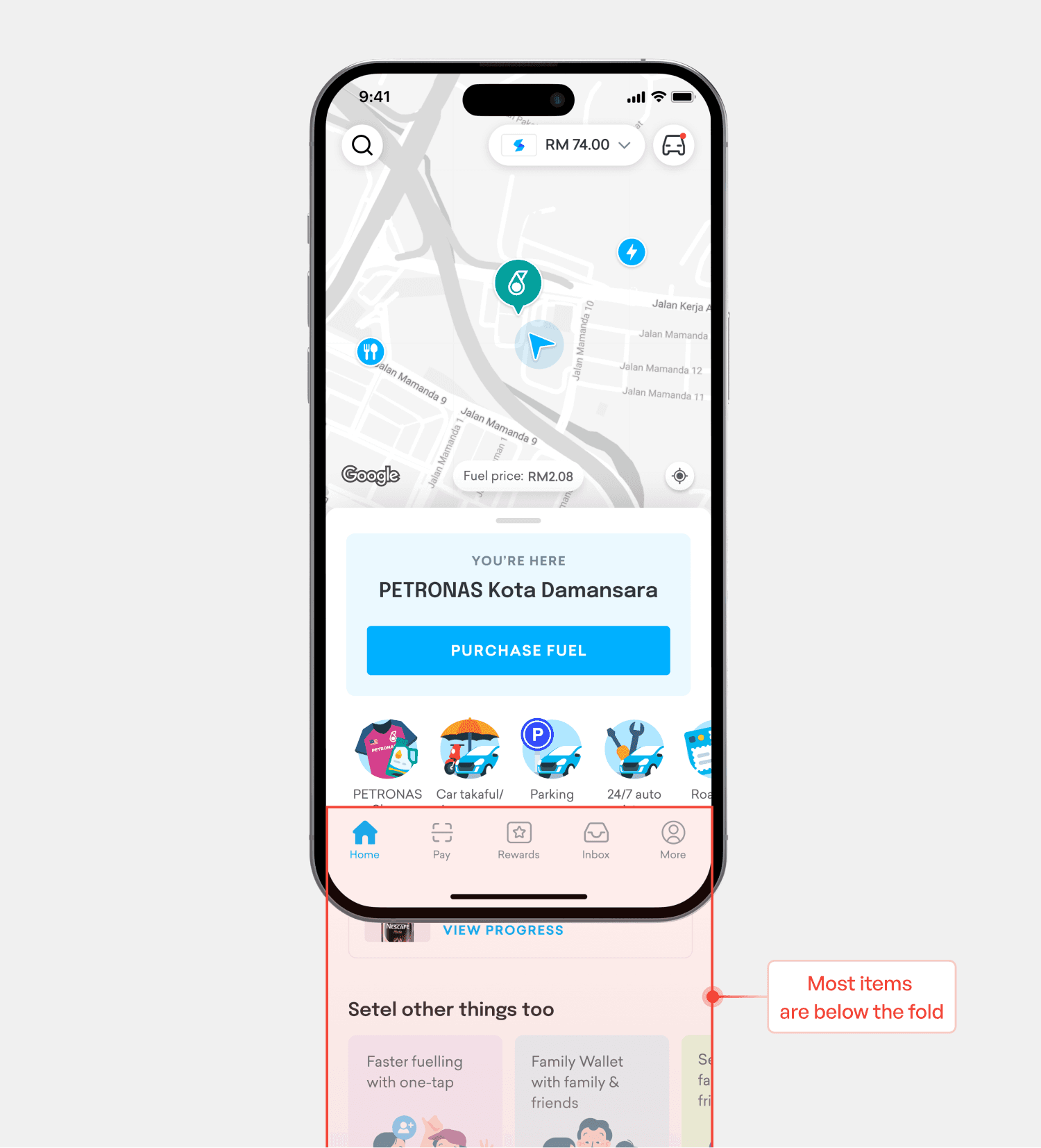
Poor feature discoverability
With the map taking up half the screen, key features are hidden below the fold. Data shows only 13% of users ever find and use them.

Friction in user segmentation
The app's fuel-centric design obscures EV charging behind a complex vehicle registration flow, leaving most EV users unaware the feature exists.


Research
With no single brief to design toward, I used research to build one. I pulled from three sources to shape our initial direction before touching any explorations.
Existing User Research
Data Analytics
Working with the data team, I dug into Setel's app usage patterns.
The finding that had the biggest insight was that more than half of all app launches were happening outside the fuel station.
That wasn't what any of us had assumed. The homepage had been designed entirely around the fuelling journey, but the majority of users were opening the app in contexts where fuel was irrelevant.
Competitive Analysis
I reviewed homepage designs of super apps locally and internationally.
The pattern was consistent: every mature super app had moved to a tile grid to make its service range immediately legible.
Taken together, these three inputs pointed in the same direction. The homepage needed to:
stop assuming every user was at a petrol station,
make the full service range visible without requiring any scrolling or exploration,
give EV users a version of the experience that felt relevant to them.
Design explorations
A few key design opportunities were identified which would be the foundation of our redesign.
1
To map or not to map
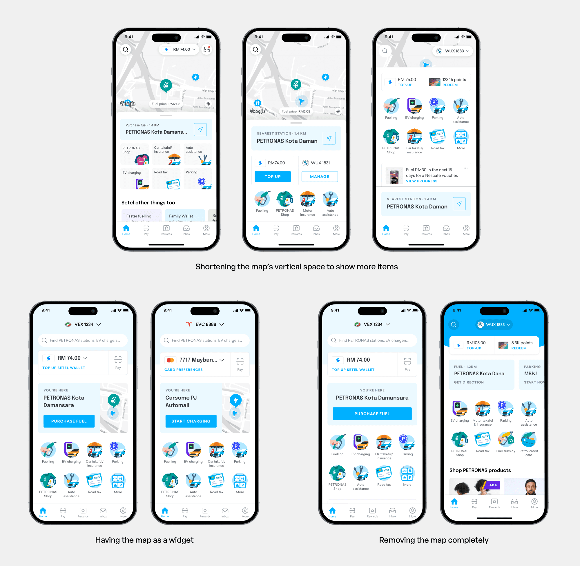
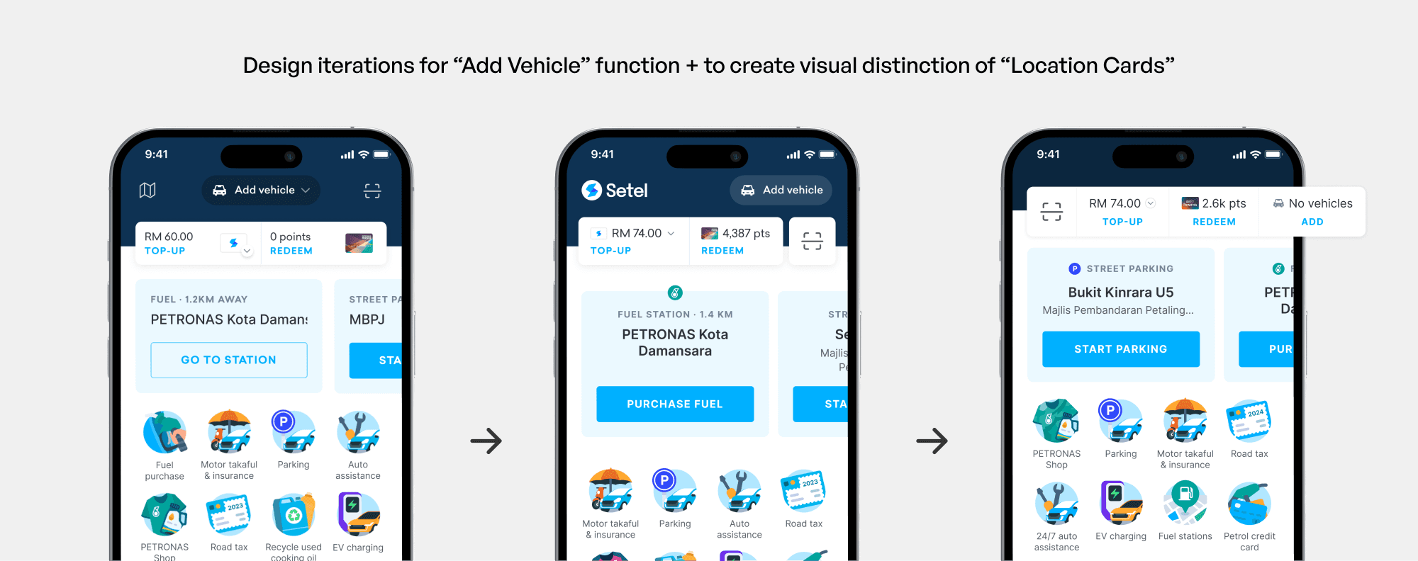
The map was the most opinionated call. It had been Setel's visual signature since launch and removing it felt risky, especially when there was no direct usage data to prove users relied on it. The team agreed to use the upcoming usability test as the decision mechanism: we'd remove the map from the prototype and observe whether users noticed or missed it, treating it as a hypothesis rather than a commitment.
On my end, I worked through three directions in sequence — a full map, a map shrunk to a widget, and finally no map at all. Each reduction helped the team viscerally see how much space was reclaimed for content, which shifted the conversation from identity (the map is who we are) to utility (what is the map actually doing for users).
2
Segmentation of homepage for EV users
Since EV users would not want to see fuel features, the aim was that they shouldn't see a fuel-centric homepage. However the logic of when to show EV content was harder to pin down. A purely location-based approach seemed like the obvious solution until we hit an edge case that complicated it: some Petronas stations also have EV chargers, making location alone an unreliable signal.
The solution was a hybrid: vehicle type as the primary personalisation layer, with location as the secondary trigger. If a user had registered an EV, the fuel card would be replaced with an EV card. However any user were near a charging only-enabled location, that card would surface dynamically.
3
Improved discoverability of features
Resolving the map freed up enough screen space that a full service grid became viable above the fold.
Usability testing
For testing, I built multi-flow prototypes to simulate a seamless end-to-end experience, which became the backbone of the sessions. Our user research team ran the moderated in-person testing with 20 participants, and I joined each session to manage the prototype and probe deeper where responses were interesting. The map was intentionally left out during the test as we wanted to see if users would notice on their own.
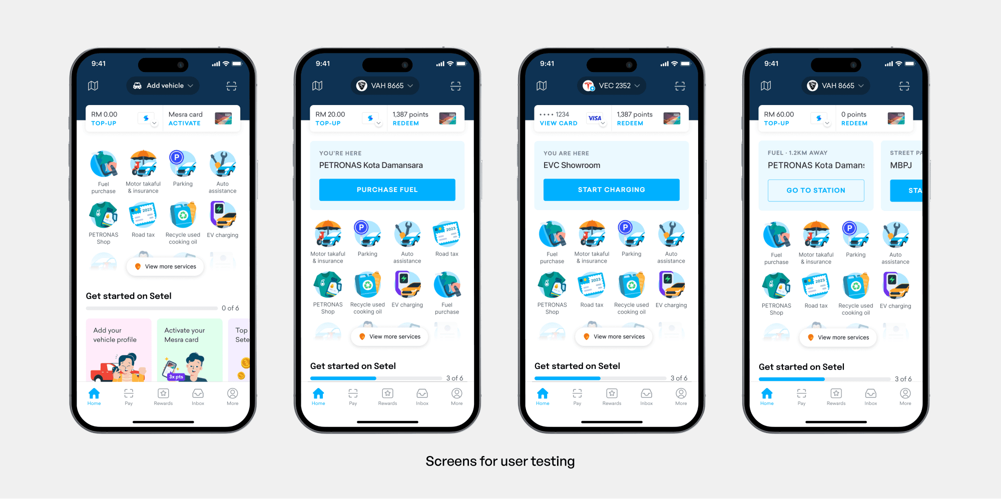
In short, we only achieved our goals partially
Improved discoverability of features
All users understood that Setel offers more than just fuelling with the new homepage.
Map’s absence wasn’t an issue
Users didn't notice the map was missing until it was highlighted to them, suggesting it wasn't a key feature.
Personalisation for EV Charging purposes
EV users were delighted of having a surfaced EV card
EV user unaware of the Add Vehicle function
When prompted, user feedback is that they didn’t notice the button
Location cards are too similar visually
Users can't differentiate between parking and fuel card
Both issues fed directly into the next iteration. The location cards were reworked with stronger visual differentiation, borrowing the distinct icons from the original map. The Add Vehicle prompt was pulled out of its pill and moved into the action bar, where testing had shown users were already looking.
What I learned
Navigating ambiguity
This project started without a brief, a clear owner, or aligned priorities. Every vertical had a different definition of what the homepage should do. Getting to a design direction meant understanding those competing interests first, and finding a way to move forward that didn't alienate any one team. This collaborative narrowing of the problem space shifted our focus from a reactive stance to a proactive, goal-driven approach.
Designing for scale means deciding what not to show
Setel had grown to offer fuel, EV charging, parking, insurance, payments, etc. and the temptation was to surface all of it. The real design challenge was figuring out which features deserved homepage real estate, for which users, and in which contexts. Prioritisation and trade-offs has to be made to make it possible.
